
The Psychology of Colors in Brand Photography: What Your Palette Says About Your Business
In the grand tapestry of brand identity, the colors that frame your business are as telling as the logo that defines it or the motto that speaks its purpose. Through the strategic use of colors in brand photography, businesses convey subtle psychological cues that can influence consumer behavior and perception. This interplay of hues and emotions is not just an art; it’s a science that, when mastered, can elevate brand storytelling and forge deeper connections with the audience. Let’s explore what your color palette says about your business and how it can shape your brand’s narrative.
The Science of Colors in Branding:
Color psychology is the field of study that examines how colors affect perceptions and behaviors. In the context of brand photography, every color has an associated set of emotions and messages that can either attract or repel your target market. Understanding these associations is vital for crafting visuals that echo your brand’s essence.
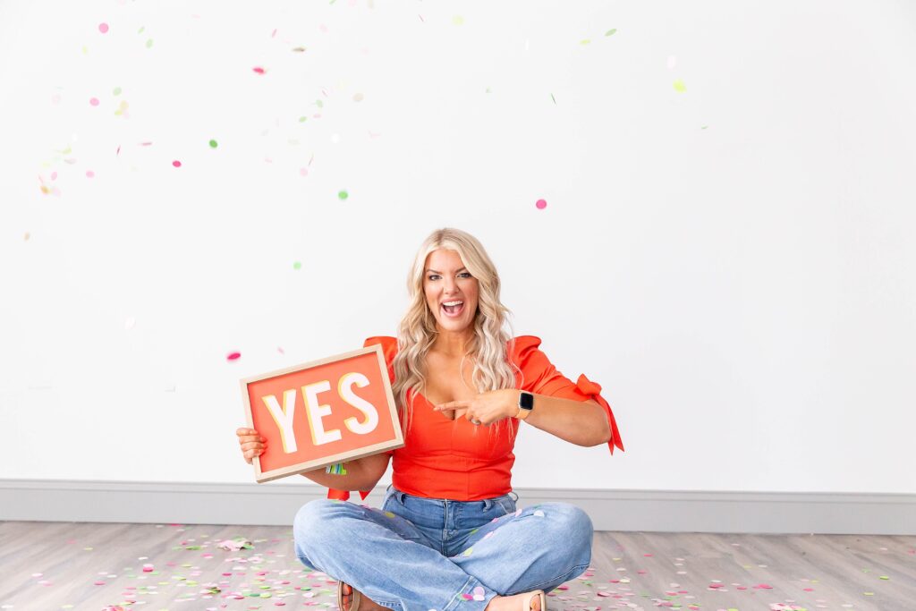
- Red: Energy and Urgency
Red is a color of passion, energy, and action. It’s often used to create a sense of urgency or to draw attention in sales and clearance events. For brands, the use of red in photography suggests confidence and can stimulate a physical response in viewers, potentially increasing their heart rate. If your business is centered around action, sports, or desires to convey a bold stance, red might be your go-to hue.

- Blue: Trust and Dependability
Blue, a color that often reminds us of the sky and the sea, evokes feelings of trust, security, and stability. It’s no wonder that many banks and tech companies integrate shades of blue in their brand imagery. Utilizing blue in your photography can communicate to customers that your business is reliable and trustworthy.

- Green: Growth and Health
Green is synonymous with nature, and it signifies growth, health, and renewal. Brands that emphasize organic products, eco-friendliness, or wellness often choose green in their visual branding to symbolize their commitment to natural and sustainable values.


- Yellow: Optimism and Clarity
Yellow shines with optimism, clarity, and warmth. It can inspire a sunny disposition and stimulate mental activity, making it an excellent choice for brands that want to appear accessible, friendly, and cheerful in their brand photography.
- Purple: Luxury and Creativity
Purple is the color of royalty, luxury, and creativity. It’s a great option for brands that want to exude sophistication, wealth, or artistic quality. Including purple in your brand’s photography can give an air of exclusivity and premium appeal.

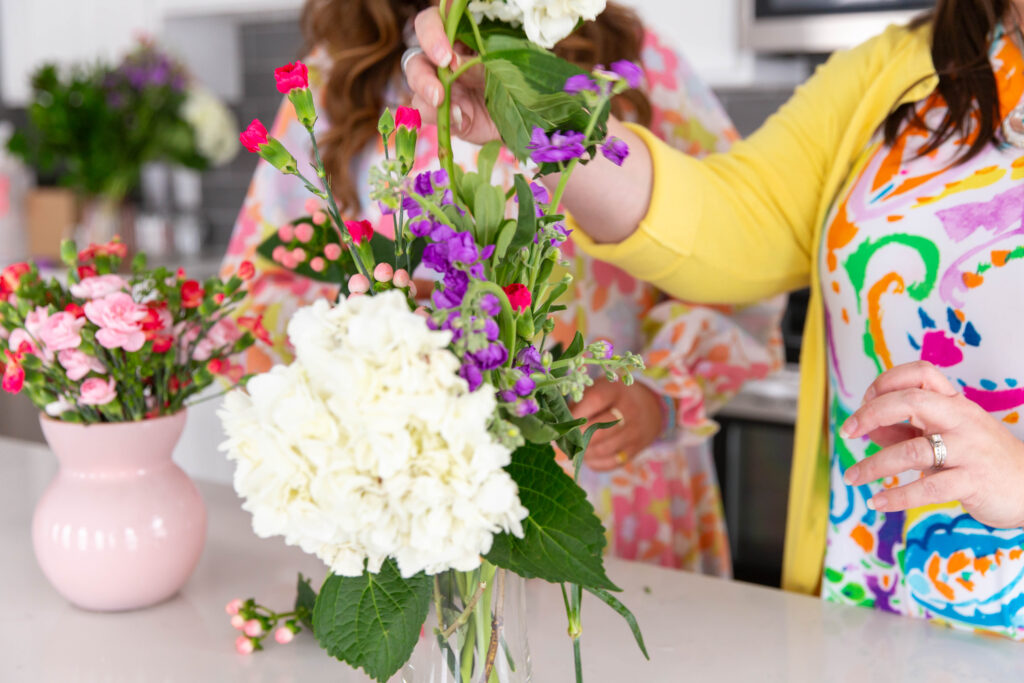
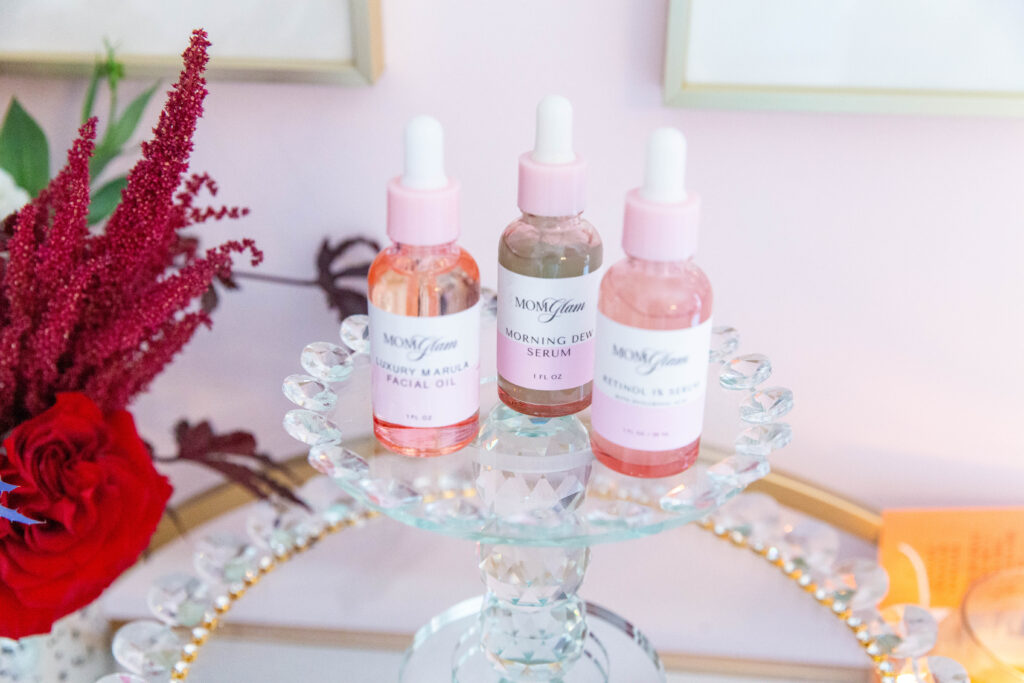
- Pink: Femininity and Compassion
Pink, often associated with femininity and compassion, could serve as a primary color for brands that want to present a softer, nurturing side. It’s also seen in brands that are reaching out to a primarily female demographic or promoting products related to beauty and self-care.
- Orange: Excitement and Enthusiasm
Orange combines the energy of red and the happiness of yellow. It is associated with joy, sunshine, and the tropics. Brands that use orange in their brand photography want to show that they are friendly, cheerful, and confident.
Implementing Your Palette in Brand Photography:
After identifying the colors that align with your brand’s values and vision, implementing them in your brand photography requires a delicate balance. Consistency in color usage helps to create a cohesive brand identity, but it’s equally important to consider context and composition to avoid overwhelming your audience or diluting the impact of your color choices.
The palette you choose in your brand photography isn’t merely a matter of aesthetic preference; it’s a strategic decision that speaks volumes. Colors can act as silent ambassadors for your brand, conveying messages and emotions that words might not capture. As you consider your brand’s visual identity, let the psychology of colors guide you in painting a picture that not only looks appealing but feels right to your customers.
Remember, the insights shared here are based on general associations with color. Each color can have multiple meanings, and cultural differences can affect color perception significantly. Therefore, when selecting colors for your brand photography, it’s crucial to do so with a mindful awareness of your specific audience and their unique contexts. Your palette is more than decoration; it’s a powerful tool that, when used effectively, can define the essence of your business.


Comments